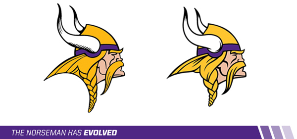
Here are the new changes to the Vikings logo, according to the Star Tribune:
1) Horn Shape
The shape of the horns has been adjusted and the shading in the horns has changed.
2) Horn Base
The base of the horn now resembles the horn on the players’ helmets.
3) Face Detail
Thicker lines have been added to the mustache and face.
4) Vikings Gold
The Vikings Gold is now brighter and less brassy.
5) The Braid
The braid has been shortened, resulting in a reduced logo height.
And here's the organization's explanation for why these changes are being implemented now:
As the Vikings transition into the drafting of plans for the new stadium and the prevalent Norseman usage throughout that facility, the team realized this is the appropriate time to make these logo enhancements. The evolution will not happen overnight; Vikings fans can expect to see both versions of the logo during the transition period, but the enhanced mark will be noticeable immediately throughout vikings.com. Merchandise with the enhanced Norseman could be available as early as March. ... We are looking forward to many exciting changes for our team and fans in the next few years, leading up to the opening of our new stadium. These logo enhancements are just the beginning...
Good thing they made the change. Don't want to be associated with that past filled with Super Bowl defeats. Oh wait. They hardly made any changes at all. Go Pack go.
No comments:
Post a Comment